Showing posts with label Contextual Portfolio Year One. Show all posts

Wednesday, 17 June 2015

| Katerina Plotnikova |

| Katerina Plotnikova |

I remember seeing Katerina's pictures before, as I can recall seeing a number of her wonderfully, beautiful animal photographs. 
I have always been quite fascinated with animals being in photography, as it's unpredictable as you do not know what the animal will do. However, with Katerina she uses animal trainers to help create the perfect shot that she can.

She has used various animals, like that of: 
Bears, Wolves, Deer, Moose, Foxes, Tarantula, Snakes, Owls and many more. I think that all the animal shots are her best, as I love seeing humans interacting with quite dangerous animals as I love the uniqueness and surprise of the photographs. 

Of the animal shots, I believe that the Fox, Bear and Wolf ones are my favourite. I love them animals in general which is going to make me feel more passionate towards the photographs that she got of them, however the models included also make the photograph. I love that the models are wearing beautiful silk dresses whilst being with these animals. 

I love the pink silk dress with the bear, this photo makes me feel so happy and it looks incredible. to be able to get that close to a bear is wonderful. I am in complete awe of her work. 
Katerina's work to me is really inspiring and is a wonderful piece of art. 


| Namie Amuro |

| Namie Amuro |


Play Namie Amuro’s video in fullscreen mode and put your finger in the middle of the screen. It’s the perfect way to kill some time before that boring meeting you’re waiting for.

I first saw this video on a link from a social media website called Buzzfeed, this showcases various things from photos - videos - quizzes etc.
After being transported to the webpage from Buzzfeed's FaceBook link, I then watched the video from Youtube (Below).

I think this video is really unique, I love that it's quite interactive meaning that it is something that gets the viewer involved, and I like that. I like that you have to keep your finger on the DOT for the whole video.
 I also really like what happens throughout the video, as in the way everything looks front the angle you view the video with your finger on the dot..

I liked the basketball being spun on 'your' finger, to popping the girl's chewing gum. Overall, I believe that this is a very fun and quirky video from a very interesting artist.

| Arve Båtevik |

| Arve Båtevik |


I first found Arve's work on Behance, I was looking through on my activity feed and I saw some very interesting and beautiful work on a book. In the corner of the book I saw that it was cut out, and left a very interesting pattern. The book was made of card, or of a similar material so it could create that very interesting design in the top right hand corner. 

After more depth into Arve's work, I went onto his website and it is very simplistic, clean and beautifully created. 
The website is: http://arvebaat.com

He has had various designed jobs working in Switzerland, and Oslo – Norway. 


| HELVETICA / AN ODE TO HELVETICA |

| HELVETICA | AN ODE TO HELVETICA |


Helvetica [An Ode to Helvetica] is on Behance is by Rui Xu.
" Helvetica [An Ode To Helvetica] Type Design from the last 50 years. Editorial design project about the film “Helvetica” directed by Gary Hustwit. It features biography, opinion and work by David Carson, Massimo Vignelli, Paula Scher, Erik Spiekermann, Neville Brody, Stefan Sagmeister, Experimental Jetset, Wim Crouwel, Michael C Place and Norm. "

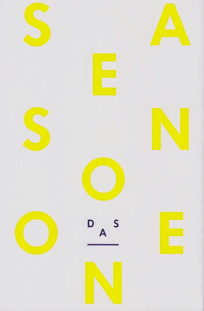
I remember at University when Gary Hustwit came to talk to us about his debut film of "Helvetica", and when I was on Behance I saw on my activity that someone had created a book about the film, by Gary Hustwit. Above is his description of the work that he had produced for this particular set of work and below is the images of that book.

| I found that the book looked beautiful, I loved the subtle yellow on the cover and keeping that theme throughout the book was very clever. I also liked that on the David Carson title page, there was a picture of him with the same yellow. 


| Monument Valley Press Kit |

| Monument Valley Press Kit |


Monument Valley is an iOS and Android game, and it came out on the 3rd April, 2014. Monument Valley is a puzzle game, where you play as Princess Ida and you try to get her through the designated scene away from the crows. These scenes are also like mazes with optical illusions included. The game is presented in an Isometric View, which makes for seamless play, as I play this game on the iOS version, it is beautifully created and looks impeccable. 

This game was developed by USTWO.

I went onto the Monument Valley website: http://www.monumentvalleygame.com
where you can download the Press Kit for yourself.

Within the Press Kit, you receive a number of folders in which there is concept art, press release, screenshots and visuals assets. 


| TOKYO GHOUL CHAPTER 31.5 |

| TOKYO GHOUL CHAPTER 31.5 |

TOKYO GHOUL is of the manga style of art, and this comic is about a World in which there are humanoid like beings which are called Ghouls, that coexist with humans. Ghouls are like ordinary people however, for their diet they have to survive on human flesh. 

Below is the cover for the Chapter 31.5 of TOKYO GHOUL.
The main character of the comic is Kaneki, he was originally a human however due to an accident involving a Ghoul he also ended up becoming half Ghoul and half Human, after being implanted with Ghoul organs.

The image below is of Haise's interpretation of how he view's Kaneki. 
Kaneki in recent chapters has lost his memory due to being stabbed in the brain, now Kaneki has been given the name and the persona of Haise (which is still Kaneki, just without his memories).

I really like the cover art for this chapter. I love how sweet and young Kaneki looks however that is what this chapter wants you to think. 
I love this style of art, I've always been fascinated with anime and manga so when I was first shown TOKYO GHOUL, I found it to be really well drawn. 

In the Anime Adaptation and the manga we see Kaneki's eye changes to that of a Ghoul eye. The pupil stays black, whereas the Iris changes to that of  red, and then the whites of the eye turn black. (IMAGE BELOW)


Review | Nylon | The Music Issue | July 2016

| Marina and the Diamonds | 


I recently saw this magazine on Instagram whilst searching one of my favourite bands, which is Marina and the Diamonds. I love Marina's music as it's so unique to anything I've heard, it's quite poppy yet some of her songs have a melancholy vibe.

 Her first album was The Family Jewels which was released on the 15th February 2010, which featured the hit song of Hollywood, and also I am not a Robot. On this specific album it has been described at Indie pop, and also that of a new wave era. 

The Second Album was Electra Heart and this was released on the 27th April, 2012. I like that the first album to this one was two years apart. I liked that as it kept fans on their toes as to when her next album would surface. 

Now the third album by Marina and the Diamonds is titled as Froot, and this album came out on the 13th March, 2015. The thing that was different about this particular album of her's was that she stylised it to become a "Froot of the month" sort of thing, meaning that 6 six of the songs on the album would be released to fans every month. These songs were that of "Froot", "Happy", "Immortal", "I'm a Ruin", "Forget" and also "Gold".

| Nylon | 

The magazine of Nylon is very unique, I've not really heard much of this magazine which is a shame. I didn't look into many of the other covers for this magazine but I did see a couple which I liked which will be showcased below in image form, with a little description. 

As to the Marina cover, I thought that this was a beautifully artistic cover. The way the colours popped on the front gave so much to Marina's attitude and to her music. The colours are that of blues, pinks and oranges, and these stand out from the other magazine that would be next to them on the shelf in magazine stores across the world. 

As I couldn't find this particular magazine in any shop or even online to be shipped directly to me, I had to read this magazine on the Nylon, website: http://www.nylon.com
Then I looked at the article about Marina: http://www.nylon.com/articles/marina-and-the-diamonds-cover-story

/ Everything on this article is do with her newest album of FROOT and about her processes to come up with the album and amongst other things. This article also talks about the previous albums with the inspiration that came with them, I particularly liked the album of Electra Heart. I liked this album so much because of the music itself but I also liked Marina's alter-ego. I liked that she wore a platinum blonde wig, and was associated with pink/barbie and bubblegum.


Friday, 8 May 2015

Workshop Week Book Design –

Designing a book is usually regarded as creating visual imagery for the books cover, however, that is not the case. There are many other elements of a book that can be designed, including but not limited to layout, size and the type of paper or card used within the text. Within this workshop we were challenged to create a concept for a book design and its purpose within a short period of time.

Before we started we were all shown a variety of different carefully designed books and how they can take many alternative forms and include various sorts of mediums to that traditionally perceived.  Some of the books shown, were very beautiful as I love books, I believe that a good book is also based on the books design. I saw that some of them, were opened bind which is where you can see the spine and thread. 

Overall, this workshop was really fascinating and intriguing for me. I really liked knowing how to create books in certain ways and it was interesting knowing all the details required.

Monday, 27 April 2015

Access Issue 02, Magazine //

This was kind of tricky to establish as a magazine. This is a paper style magazine, but paper like that of a newspaper. However, all that aside I am going to class this as a magazine which is to do with PlayStation. Access is published for Sony Computer Entertainment UK Ltd in London.

On the front of this 'magazine', it states at the top 'Let The Games Begin' I believe that for a games magazine, this tagline is perfectly suited to it. Then underneath this, is another statement saying 'Gamers get their first look at the new PlayStation Vita'. The cover photograph on the front of this magazine is of a person playing on the new PlayStation Vita, then it has the PlayStation logo as well as the action/control buttons which are: X, O, ∆ , ❒ . 
Then at the bottom of the page, is the PlayStation logo with PlayStation to the side, followed by PlayStation's FaceBook page. 

On the inside pages, it starts by saying: PRESS START. I really like this simple use of text as it is reminds the audience of PlayStation, it does this by as you associate these simple words with the controller used to play the PlayStation, video games console. To left of this, there is a small section for if you design a cover for Access! You can win a prize! Clearly this is a very interesting competition where you could've won: Your design to be on the front cover of Access magazine, Sony DSLR with lenses, a NEX-7 Camera, and also that of a PS Vita and start up games. The design will also have been made into a poster by Don't Panic. 

On pages 12–13 it shows and talks about 'Inside the PS Vita", and "What exactly is so special about this new machine then? We take a closer look at PlayStation's newest toy."
/ I quite like this double page spread as it goes into in depth detail of everything to do with the PS Vita. From Nuts and Bolts and describing the CPU, Weight, Screen, Cameras etc.

I think that my favourite thing about this magazine is that the contents is at the back. I think that is a very interesting yet unique way, as normally the contents page is inside the cover page. However, I like that Access magazine chose to be different and set themselves apart from other magazines and put it at the back as the very last page. I know that this will definitely be of influence to me, in later works. 

I again, asked my boyfriend of what he thought about this magazine as I wanted his opinion. Here is what he said below:

/ He likes how the front page has a white border and that he also like how the icons are overlapping the edge of the page. He said that he also likes how the writing isn’t taking up much of the front cove and also how the logo is situated at the bottom of the page too.

He said that he likes how the contents page is situated on the back of the actual magazine, and at the bottom of this it has all the relevant information ie: thanks to and all of the staff involved.

He states that he likes how on each of the pages it has differentiating text sizes as well as on the same line, and across the top of the pages. He likes how the magazine resembles more of a newspaper with it's finish rather than a glossy or laminated magazine. He feels that there are some colourful pages that are located on certain pages, which he also likes. Though he feels as though the magazine feels slightly weaker and thus it could break easier. He also likes that how at the beginning of some of the paragraphs they start with a giant colourful letter that will grab your attention and also on some pages it is a different colour.


Dazed Magazine //

For 20 years, Dazed & Confused Magazine has been at the forefront of youth culture. Defining the times, each issue showcases agenda-setting editorial and pioneering fashion photography. Based in London but created by an international collective of writers, image-makers and stylists, Dazed and its website dazeddigital.com is read in print and online by over 1.7m style leaders. It is quite simply the most influential and successful independent magazine title on the planet.

A couple of weeks ago I purchase VOL IV Spring / Summer 2015; of Dazed Magazine, I purchased this simply because of the design of this beautiful magazine. I also love how fashion magazines are laid out, I think that because of just how simple, yet clean each page looks to me. On the cover of my magazine, is that of Maisie Williams (Arya Stark – Game of Thrones), with the tagline 'Absolutely Flawless'. I really love this cover I think that the main photograph is beautifully shot and how the font and tagline go really well together within this main image. 

Inside the cover pages is a few images of that of designer clothing and watches, with beautiful models to show off the clothes and accessories. After a couple of pages in we see a contents page, this is quite a simple yet clean and crisp page. The top reads 'Contents', then to the left you see 'The Cover' with a simple photograph of Maisie Williams on front same as the main cover photo. Underneath that photograph however, it states what clothing she is wearing in the said picture, and also it states the photographers name and who the styling was done by. 

To the right of all that, it states 'The Front', followed by a long list of page numbers followed by what is being showcased on the pages. After this, on the next page is page dedicated to the hard staff who I believe would've worked of this particular volume. It states: Editorial, Fashion, Design, Advertising and Creative Solutions, Publishing, Contributing Editors, Photography, Digital Design and Production, Production, Video, Text, Marketing Events and PR, International Editors, and also Finance. 

Although this magazine is a fashion magazine, I really love the way that this has been produced and how the pages feels glossy. I remember my brother telling me that if the magazine is glossy that it is a lot cheaper to print. Even though that this is true, I still think that this is a beautifully created magazine.


I asked my boyfriend to give me his opinions on the magazine and this is what he told me:

/ He said that he liked that the numbers on the pages as they were not to the very edge of the page itself, but because it was in the middle of the page underneath text / imagery. 

/ He also stated that he likes that one particular image was quite small, and that it wasn't centred within the page that was sort of, off centre and it was on a double spread.

/ On Page 40 there is an image to do with 'Walk on the Wild Side' here this particular image is set within a circle, i.e. the whole image is spherical. He also stated that this image was aesthetically pleasing. 

/ On Page 113, he described what he saw when he saw this page, here there was an image bang-smack in the centre with text all around but not going all the way across. The text was in small chunks / sections,  around this chosen image. He said that he liked the way that the main focal point of this particular page, was that of the photograph.

/ He also found whilst looking through the magazine that the text varies within certain pages i.e: where it is a full two page spread of text, and also that it is often off centred, and that it isn't fully filling the pages. It's inline, but it's not spread fully. He likes that there's quite a lot of white space as it is clean and easier to read.

/ For the cover he said that he likes that the barcode is to the top and on its side instead of being in the typical position for magazines, being in the bottom left / right. He likes that the cover is clean and that there isn't much writing on it, he said that the fonts stand out cleaner and crisper. He has also found that even though glossy magazines are easier to produce he still likes it, as it fits the magazine better than what a standard paper stock magazine would. Even though the magazine scratches easily, it still feels well produced.


Iconology / Iconography //


Iconology:

/ One of the things that came up when we were looking at semiotics was how metaphor is used in visual communication – which leads nicely into this session on Iconology.

/ Where we were looking last week at different theories which claim to explain how words and images communicate meaning (how we translate words and images into meanings through a shared knowledge of coded systems), today we’re looking at how broader meanings, and different nuances of meaning, can be communicated within these signifying systems. Iconology is about how we use individual – as well as collective – understandings and interpretations to seek a depth of meaning and nuances of meaning beyond that first level of semiotic communication. So, where Semiotics tells us that the phonemes (‘codes’) ‘r’ ‘e’ ‘d’ make up a bigger word (‘code’) ‘red’ which we have learned to associate with the colour we all think of when we hear the word ‘red’, iconology delves into the symbolic, cultural and, at times, idiosyncratic meanings associated with ‘red’. In this session we’ll consider what is being communicated within the context of particular examples of visual communication, and how, as interpreters and creators of graphic design/art/animation, we can play with that ‘gap’ between reading and interpretation (between the page/screen and its audience) to creative effect.


/ The study of meaning contained within in a particular work of art or design, and the branch of art history that addresses the description, analysis and interpretation of images.
Meanings are not always immediately obvious - this can enhance their impact.
Historical and theoretical context - Erwin Panofsky - iconologist - Studies in Iconology (1939).
Using visual evidence to 'unlock' meaning.

Iconology:
/ Iconology is the study of the meaning contained within the symbols in a particular work of art.

/ Culturally specific. It examines the symbol on more than its face value and tries to find meaning by reconciling it with its historical context. To find out about the ORIGINS, purpose and meaning of something.
/ Looking as opposed to just seeing. 

/ Metaphor - where meaning is derived through association, comparison or resemblance.


TV Advertising //

Within TV Adverts around Christmas:

/ Tesco tends to shows different family members and different households in the run up to the christmas period decorating their houses etcetera. This uses a family feel for which a lot of people can relate to as it is viewed as what christmas is about, family.
/ Sales for Tesco during the christmas went down.

/ M&S used Magic fairies this year 2014/2015. The music is fitting for christmas, this shows the magic or christmas and the glamor aspect. Sales did see a 2% fall.

/ Lidl is a value supermarket and everyone knows it they're not denying it. However in this advert they show that you can still receive quality for a low price, which is fitting as now most people are turning to these stores instead of high street ones.

/ Sainsbury's 2014 marks 100 years since world war one started, here they have taken a piece of the war story that captures a part of that war which showed compassion and care. Playing football with the Germans and taking a break from war, even though this was a heartfelt and compassionate advert this did not help there sales either as they too went down by two percent.


Tesco Christmas Light Show (TV Advert 2014) from Immersive on Vimeo.


Revolutionising the Image //


Modern Life is Rubbish?: Revolutionising the Image
/ Style, Cubism & Futurism

What exactly do we mean when we talk about styles and movements in the history of art or design?
/ The Canon – See story of Polykleitos’ bronze sculpture entitled – Doryphoros (The Spear Bearer). A theoretical work which comprises a set of aesthetic principles governing the work’s proportions, meaning ‘rule’. The proportionally ‘perfect’ work of art. A yardstick – a measure of what they believed art ‘should’ be, the quintessential embodiment of ‘good’ art.

/ The Western art historical canon denotes a body of books, music and art that have been traditionally accepted by Western scholars as the most important and influential in shaping Western culture. Idea of the celebrity artist or designer and the masterpiece.
/ Canonised – accepted into the canon. 

/ Survey text – characterised by key individuals who represent styles and movements.


What is ‘style’?:
A definition: Specific rather than simply a methodology. A particular kind, sort, or type, as with reference to form, appearance, or character e.g. the baroque style. Or...
/ A particular, distinctive, or characteristic mode of construction or execution in any work of art/design.

/ A way of doing something, especially one which is typical of a person, group of people, place or period (in the style of...).

/ Used to classify and to describe e.g. when, where or when something was created/developed. Used to group and match works. When we study the style of something we are looking to place it in a relationship of similarity (and difference) with other works.

/ How do we categorise and name works /movements in art and design? – Shared characteristics.
Styles or movements are dialogical – meaning that they come about as part of a dialogue or conversation with previous styles – either embracing or reacting against elements of those styles.
If something is stylised, it is represented with an emphasis on a particular style. Style was described by Meyer Schapiro as ‘a system of forms with a quality, through which the personality of the artist and the outlook of a group are visible’.

/ Art/design ‘movement’, a definition:
A tendency or style in art with a specific common philosophy or goal, followed by a group of artists during a restricted period of time.

Propaganda Poster //


Propaganda:
A form of communication which aims to persuade, influence and change
attitudes. The term is often assumed to have negative connotations, however, arguably,
propaganda has been used throughout history to both enlighten, as well as to mislead, the
public.

/ Wartime posters are one of the most recognisable examples of propaganda.

/ An effective means of conveying messages, propaganda often works by manipulating
information, such as displaying facts selectively, or using loaded text and images, as well
as relying on shared cultural understandings and metaphorical devices. At times
propaganda even falsifies information.

/ Propaganda in the First and Second World Wars was used to recruit volunteers (preconscription
in 1916), to influence financial backers, to rally support and to raise morale,
both on the domestic front and at the battlefield.

/ Wartime propaganda reflects – as well as having promoted – many of the art and design
styles and movements we are now familiar with.

Pinterest //

On my Pinterest account I created a 'Board' titled 'Design', and put plain and simply this is all the work under the topic of design that I find to be of interest to myself. I have a numerous list of pins onto this one board, 361 pins with 20 followers. I believe that this board has a variety of design on it, ranging from Magazine Covers, to other unique bits of design I enjoy or are simply beautiful to look at.

Seen as though this new topic is do with that of magazine design and layout I looked and pinned more of that specific genre of design. I believe that I have some beautiful sets of covers and contents pages to even how people / companies layout their work. I liked to pin these as then I can go back and get more inspiration from this. I believe that having a Pinterest account for this is again, excellent for giving me inspiration and gets my mind into thinking of beautiful covers and also that of layout design. I also have a variety of colours on there too, and even that of colour palettes.

I think that noting down all pieces of design that help will definitely help me in the long run with the Graphic Design course, it will keep all of my little inspirations in one clear place and will be easy for people to look at. I have had some good feedback on my boards on Pinterest, as they get the odd 're-pin' sometimes.

For Magazine covers however, I have a very refined list of all the ones that I do truly find to be stimulating. Below I shall post a few of the ones I like:


Man VS Machine Lecture //

Man Vs Machine Lecture:

/ This lecture was presented from Matt Whitewood where he came to University to talk to us about his work for a company called Man Vs Machine. He is a graduate from the Huddersfield University and he also has a degree in Digital Media.

For one of the projects he showed us, it was for Nike KD7 which he has input towards. This particular project was for Nikes new trainers, I thought that this was a rather beautiful piece of work which he showed during the lecture we had. This advert has a variety of effects and I remember seeing it and thinking that it was a stunning piece. The subtlety of the animation of how smooth it looked and how it flowed onto the next piece was inspiring. 


Nike / KD7 from ManvsMachine on Vimeo.

Semiotics //

Why do we even need to learn about semiotics??

Semiotics are the tools of the trade, it helps our vocabularly and also the confidence in our own ideas. So, we the professional designers can inform the client(s), viewers / audience about how that the choices that they make, can effect and transform the message that they want to be delivered for that of an intending audience. Also, it is about the ability to explain how visual communication works, how this can be manipulated to the benefit of the message, and of how a professional adds value to a product or a specific key area that separates the professional from the amateur.
It is not just about having the tools and the knowledge to make design that looks good; we need to be able to analyse and explain why our ideas work.


All good designers are semioticians:
/ Semiotics – the theory(ies) which explore how systems of signs work to make meaning.

/ Signs - spoken and written language, codes, symbols, sounds, non-linguistic. Signs can mean different things to different people depending on individual experiences, expectations. Signs can have an emotional impact.

/ As both creators and consumers of visual art and design – and as participants in a culture which functions on the basis of shared meanings and common understandings – we decode meaning from signs and symbols with ease. We are highly sophisticated readers of signs and do this subconsciously.

/ A good idea along with a brilliant aesthetic may fall down in the absence of proper and effective communication of the idea through the aesthetic. This is where semiotics comes in: Understanding semiotics can help us to ensure we're communicating messages effectively.


Semiotics – the basics:
/ Understanding how words and images – together with ideas and interpretations – are used to make sense of the world.

/ How words and images communicate meaning.

/ To understand how design works, we need first to understand how language – visual and verbal – works.


Colour semiotics:
/ Colours as ‘coded’ - how do colours act as vehicles for communicating a specific message or evoking a certain emotion?

/ Culturally conditioned – through habituation, interpretation becomes subconscious. Our actions and thoughts – the things we do automatically – are often governed by a complex set of cultural messages and conventions, and dependent upon our ability to interpret them instinctively and instantly. When we see the different colours of a traffic light, we automatically know how to react to them. This response has been taught – we learn such responses as children. For many signs, an amount of cultural knowledge is required to understand its meaning (or to interpret it in the desired way). Viewing and interpreting (or decoding) signs enable us to navigate the societal landscape.

/ 'Reality is divided up into arbitrary categories by every language and the conceptual world with which each of us is familiar could have been divided up very differently. Indeed, no two languages categorize reality in the same way. As John Passmore puts it, ‘Languages differ by differentiating differently’ (Passmore 1985,24)’. (Daniel Chandler, Semiotics)

/ Two approaches to understanding visual communication have become definitive foundations for examinations of the topic. Ferdinand de Saussure (Swiss linguist) and Charles Sanders Peirce (American philosopher).

/ Saussure’s Course on General Linguistics. Theory of signs and symbols which he called Semiology. Revolutionary in the world of linguistics, put culture at the centre of thought. His ideas were founded on the principle that there are no ideas in the mind before language puts them there: 'In itself, thought is like a swirling cloud, where no shape is intrinsically determinate. No ideas are established in advance, and nothing is distinct, before the introduction of linguistic structure.‘ (Saussure).

/ Phonemes (sounds) form words, which in turn are signifiers: c -a –t / ‘cat’ = ‘signifier’. The thing to which it refers (a cat/idea of a cat) = the ‘signified’. The two brought together = ‘sign’.

/ Peirce – how we make sense of the world (not purely linguistic), tripartite model comprising the sign (or ‘representamen’) which is a ‘sign vehicle‘, the ‘referent’ and their interpretation; the realisation of what together these mean, Peirce calls the 'interpretant'. Together they make Peirce’s 'sign'.


Arbitrariness:
/ ‘Linguistic categories are not simply a consequence of some predefined structure in the world. There are no natural concepts or categories which are simply reflected in language. Language plays a crucial role in constructing reality.’ (Daniel Chandler, Semiotics)

/ Saussure noted that linguistic signs are inherently arbitrary. The fact that a meanings are expressed using different words across different languages demonstrates that neither the sound nor their written form bears any resemblance to the object/meaning to which it refers. In this sense, meaning is purely subjective.

/ Nothing about the 'c', 'a' or 't', or about the full word 'cat' have any inherent 'cat-ness' about them. Associating this word with the mental image of a cat is learned behaviour.

/ The exception – onomatopoeia (where a word sounds like the thing to which it is referring e.g. ‘crash’, ‘splat’. Dictionary definition: ‘the formation of a word, as cuckoo, meow,
honk, or boom, by imitation of a sound made by or associated with its referent.’


Peirce’s three categories of signs:
/ Symbol – no logical connection to referent, arbitrary, relies on habit or rule. E.g. words, flags, alphabet,

/ Icon – resembles the sign, likeness. Representation question – will always entail a degree of convention/agreement about modes of representation. E.g. photograph, onomatopoeic word.

/ Index – direct link between sign and object, factual relationship – causal/physical. E.g smoke is an index of fire.

/ As we learned in the lecture, many signs we read can be interpreted as one or more of these simultaneously! The boundaries are not always clear and are dependent upon context.

Creative semiotics:
/ Understanding semiotics means you can play with how words and images communicate, subvert conventions and question how it all works. 'Where there is choice there is meaning' (David Crow)
Anthony Burrill Oil And Water Do Not Mix-

/ In advertising because semiotics relies on common understandings and culturally shared conventions, even where the signified is absent the sign can still be meaningful in certain contexts.

/ Heinz ‘invisible bottle’ advert- shows that heinz ketchup is so recognisable it can be identified as it is so iconic!

Semiotics and humour:
/ Most of all jokes are rooted in an understanding of semiotics, and an ability to subvert the ways in which meaning is made and communicated

Semiotics and fashion:
/ What assumptions do we make from a semiotic 'reading' of clothing?’

/ Roland Barthes (literary theorist, philosopher, linguist) is widely regarded as one of the most subtle and perceptive critics of the 2oth century. He was particularly fascinated with language and fashion, and the history of clothes.

/ 'Clothing concerns all of the human person, all of the body all the relationships of man to body as well as the relationships of body to society' - Roland Barthes.


Anchorage and relay: (Barthes)
/ Anchorage – text which anchors or ‘pins down' how the image is read. The reader is directed through a ‘floating chain of signifiers’. The text clarifies or ‘anchors’ the meaning, hinted at through visual clues. Where the image is complex, it helps to underline a relationship between text and image. E.g. adverts, maps, narrated documentaries on TV.

/ Relay – the words and images tell a story more ‘equally’ and stand in a complementary relationship. Important in film and comic strips, the text advances the reading of the images and supplies meanings not found in the images alone. Both the words and images are fragments which together create the unity of the message – which is ultimately realised on a higher level.


Martha Rosler The Semiotics of the Kitchen: (1975)
/ Semiotics of the Kitchen is a feminist parody video and performance piece released in 1975 by Martha Rosler. The video is considered a critique of the commodified versions of traditional women's roles in modern society. Featuring Rosler as a generic cooking show host, the camera observes as she presents an array of kitchen hand utensils, many of them out-dated or strange, and, after identifying them, plays out unproductive, sometimes, violent, uses for each. It uses a largely static camera and a plain set, allowing the viewer to focus more on Rosler's performance and adding a primitive quality. Letter by letter, Rosler navigates a culinary lexicon, using a different kitchen implement for each step along the way. She begins with an apron, which she ties around her waist, and, with deadpan humour, journeys through the alphabet. The focus on linguistics and words is important, since Rosler intended the video to challenge 'the familiar system of everyday kitchen meanings - the securely understood signs of domestic industry and food production.

My Manifesto Style of Claes Oldenberg //

"I am for the design....." – in the style of Claes Oldenberg:

//

I am for the design of a bed, which carries the sweet dreams of innocent children,

I am for the design of a toothpaste, to wash away last nights antics,

I am for the design of a cloth, to wipe away the tears,

I am for the design of a bus, to carry people to distant places,

I am for the design of a book, spreading my knowledge with the World,

I am for the design of vast newspaper articles, speaking rumours and lies,

I am for the design of shoes, to travel miles in everyday,

I am for the design of traffic lights, stopping everything in its tracks,

I am for the design of a bailer, crushing everything in its wake,

I am for the design of freshly ground coffee, which enhances the flavour of chocolate,

I am for the design of asphalt, to bring together the earthy smells,

I am for the design of a knife, cutting through butter,

I am for the design of the ocean, battling waves with ships,

I am for the design an aeroplane, bringing loved ones together since 1903,

I am for the design of a phone, carrying around your data like a virus,

I am for the design of the Sagrada Família, for its ever changing design.

Donald Judd //

Donald Judd's work is veering on the Minimalist movement, his work made use of single or repeated geometric forms. His use of the geometric creations have been critiqued for a lack of content; however it is this simplicity that questions the nature of the art movement Minimalism.

My Own Opinions:
I really like Judd's work, I like how minimalist it is. I think that the certain sets of how he creates his work has a certain flow that to me, looks really interesting. I find his sculptures really quirky and that they look very interesting.

Damien Hirst //

His work calls into question about the various ideas that separate desire and fear, life and death, reason and faith, love and hate. Hirst uses the tools and iconography of science and religion, creating sculptures and paintings where there beauty and intensity offer the viewer insight into art that transcends our familiar understanding of those domains.
My Own Opinions:
I remember looking at Damien Hirst's work in High School for art. His work is really fascinating to me, I really like how very creative and how he takes a unique approach to creating artwork and to creating ideas about existence.