I found this lecture to be really quite inspiring, as I thought that Gary was just a regular guy talking about his love for typography and of graphic design. I thought it was quite refreshing to the other lectures we've had. I think it was somewhat, calmer than the rest. Maybe it was because of Gary's laid-back style of talking I really liked and found that it gave off a certain style, or whether it was intact for the film itself. Either way, I thought that this lecture was very interesting and to hear someones idea of type is interesting to me, as I myself am for typefaces.
Monday, 27 April 2015
Guest Lecture: Helvetica //
Gary Hustwit came into our University to talk about his film titled Helvetica, this was dis directorial debut from 2007. This was a documentary about graphic design and also that of typography, clearly titled 'Helvetica' by a typeface. This was a cleverly choice of title, as now everyday we see some form of Helvetica type. This film was marked as a beginning of a film trilogy of design, with Objectified, here this is all about Industrial and also product design. Here this followed in 2009, afterwards out come Urbanized, and this was about the design of cities and this then came out in 2011.

Semiotics //
Why do we even need to learn about semiotics??
Semiotics are the tools of the trade, it helps our vocabularly and also the confidence in our own ideas. So, we the professional designers can inform the client(s), viewers / audience about how that the choices that they make, can effect and transform the message that they want to be delivered for that of an intending audience. Also, it is about the ability to explain how visual communication works, how this can be manipulated to the benefit of the message, and of how a professional adds value to a product or a specific key area that separates the professional from the amateur.
It is not just about having the tools and the knowledge to make design that looks good; we need to be able to analyse and explain why our ideas work.
All good designers are semioticians:
/ Semiotics – the theory(ies) which explore how systems of signs work to make meaning.
/ Signs - spoken and written language, codes, symbols, sounds, non-linguistic. Signs can mean different things to different people depending on individual experiences, expectations. Signs can have an emotional impact.
/ As both creators and consumers of visual art and design – and as participants in a culture which functions on the basis of shared meanings and common understandings – we decode meaning from signs and symbols with ease. We are highly sophisticated readers of signs and do this subconsciously.
Semiotics – the basics:
/ Understanding how words and images – together with ideas and interpretations – are used to make sense of the world.
/ How words and images communicate meaning.
/ To understand how design works, we need first to understand how language – visual and verbal – works.
Colour semiotics:
/ Two approaches to understanding visual communication have become definitive foundations for examinations of  the topic. Ferdinand de Saussure (Swiss linguist) and Charles Sanders Peirce (American philosopher).
/ Saussure’s Course on General Linguistics. Theory of signs and symbols which he called Semiology. Revolutionary in the world of linguistics, put culture at the centre of thought. His ideas were founded on the principle that there are no ideas in the mind before language puts them there: 'In itself, thought is like a swirling cloud, where no shape is intrinsically determinate. No ideas are established in advance, and nothing is distinct, before the introduction of linguistic structure.‘ (Saussure).
/ Phonemes (sounds) form words, which in turn are signifiers: c -a –t / ‘cat’ = ‘signifier’. The thing to which it refers (a cat/idea of a cat) = the ‘signified’. The two brought together = ‘sign’.
/ Peirce – how we make sense of the world (not purely linguistic), tripartite model comprising the sign (or ‘representamen’) which is a ‘sign vehicle‘, the ‘referent’ and their interpretation; the realisation of what together these mean, Peirce calls the 'interpretant'. Together they make Peirce’s 'sign'.
Arbitrariness:
/ ‘Linguistic categories are not simply a consequence of some predefined structure in the world. There are no natural concepts or categories which are simply reflected in language. Language plays a crucial role in constructing reality.’ (Daniel Chandler, Semiotics)
/ Saussure noted that linguistic signs are inherently arbitrary. The fact that a meanings are expressed using different words across different languages demonstrates that neither the sound nor their written form bears any resemblance to the object/meaning to which it refers. In this sense, meaning is purely subjective.
/ Nothing about the 'c', 'a' or 't', or about the full word 'cat' have any inherent 'cat-ness' about them. Associating this word with the mental image of a cat is learned behaviour.
/ The exception – onomatopoeia (where a word sounds like the thing to which it is referring e.g. ‘crash’, ‘splat’. Dictionary definition: ‘the formation of a word, as cuckoo, meow,
honk, or boom, by imitation of a sound made by or associated with its referent.’
Peirce’s three categories of signs:
/ Symbol – no logical connection to referent, arbitrary, relies on habit or rule. E.g. words, flags, alphabet,
/ Icon – resembles the sign, likeness. Representation question – will always entail a degree of convention/agreement about modes of representation. E.g. photograph, onomatopoeic word.
/ Index – direct link between sign and object, factual relationship – causal/physical. E.g smoke is an index of fire.
Creative semiotics:
/ Understanding semiotics means you can play with how words and images communicate, subvert conventions and question how it all works. 'Where there is choice there is meaning' (David Crow)
Anthony Burrill Oil And Water Do Not Mix-
Semiotics and humour:
/ Most of all jokes are rooted in an understanding of semiotics, and an ability to subvert the ways in which meaning is made and communicated
Semiotics and fashion:
/ What assumptions do we make from a semiotic 'reading' of clothing?’
/ Roland Barthes (literary theorist, philosopher, linguist) is widely regarded as one of the most subtle and perceptive critics of the 2oth century. He was particularly fascinated with language and fashion, and the history of clothes.
/ 'Clothing concerns all of the human person, all of the body all the relationships of man to body as well as the relationships of body to society' - Roland Barthes.
Anchorage and relay: (Barthes)
/ Anchorage – text which anchors or ‘pins down' how the image is read. The reader is directed through a ‘floating chain of signifiers’. The text clarifies or ‘anchors’ the meaning, hinted at through visual clues. Where the image is complex, it helps to underline a relationship between text and image. E.g. adverts, maps, narrated documentaries on TV.
/ Relay – the words and images tell a story more ‘equally’ and stand in a complementary relationship. Important in film and comic strips, the text advances the reading of the images and supplies meanings not found in the images alone. Both the words and images are fragments which together create the unity of the message – which is ultimately realised on a higher level.
Martha Rosler The Semiotics of the Kitchen: (1975)
Semiotics are the tools of the trade, it helps our vocabularly and also the confidence in our own ideas. So, we the professional designers can inform the client(s), viewers / audience about how that the choices that they make, can effect and transform the message that they want to be delivered for that of an intending audience. Also, it is about the ability to explain how visual communication works, how this can be manipulated to the benefit of the message, and of how a professional adds value to a product or a specific key area that separates the professional from the amateur.
It is not just about having the tools and the knowledge to make design that looks good; we need to be able to analyse and explain why our ideas work.
All good designers are semioticians:
/ Semiotics – the theory(ies) which explore how systems of signs work to make meaning.
/ Signs - spoken and written language, codes, symbols, sounds, non-linguistic. Signs can mean different things to different people depending on individual experiences, expectations. Signs can have an emotional impact.
/ As both creators and consumers of visual art and design – and as participants in a culture which functions on the basis of shared meanings and common understandings – we decode meaning from signs and symbols with ease. We are highly sophisticated readers of signs and do this subconsciously.
/ A good idea along with a brilliant aesthetic may fall down in the absence of proper and effective communication of the idea through the aesthetic. This is where semiotics comes in: Understanding semiotics can help us to ensure we're communicating messages effectively.
/ Understanding how words and images – together with ideas and interpretations – are used to make sense of the world.
/ How words and images communicate meaning.
/ To understand how design works, we need first to understand how language – visual and verbal – works.
Colour semiotics:
/ Colours as ‘coded’ - how do colours act as vehicles for communicating a specific message or evoking a certain emotion?
/ Culturally conditioned – through habituation, interpretation becomes subconscious. Our actions and thoughts – the things we do automatically – are often governed by a complex set of cultural messages and conventions, and dependent upon our ability to interpret them instinctively and instantly. When we see the different colours of a traffic light, we automatically know how to react to them. This response has been taught – we learn such responses as children. For many signs, an amount of cultural knowledge is required to understand its meaning (or to interpret it in the desired way). Viewing and interpreting (or decoding) signs enable us to navigate the societal landscape.
/ 'Reality is divided up into arbitrary categories by every language and the conceptual world with which each of us is familiar could have been divided up very differently. Indeed, no two languages categorize reality in the same way. As John Passmore puts it, ‘Languages differ by differentiating differently’ (Passmore 1985,24)’. (Daniel Chandler, Semiotics)
/ Culturally conditioned – through habituation, interpretation becomes subconscious. Our actions and thoughts – the things we do automatically – are often governed by a complex set of cultural messages and conventions, and dependent upon our ability to interpret them instinctively and instantly. When we see the different colours of a traffic light, we automatically know how to react to them. This response has been taught – we learn such responses as children. For many signs, an amount of cultural knowledge is required to understand its meaning (or to interpret it in the desired way). Viewing and interpreting (or decoding) signs enable us to navigate the societal landscape.
/ 'Reality is divided up into arbitrary categories by every language and the conceptual world with which each of us is familiar could have been divided up very differently. Indeed, no two languages categorize reality in the same way. As John Passmore puts it, ‘Languages differ by differentiating differently’ (Passmore 1985,24)’. (Daniel Chandler, Semiotics)
/ Saussure’s Course on General Linguistics. Theory of signs and symbols which he called Semiology. Revolutionary in the world of linguistics, put culture at the centre of thought. His ideas were founded on the principle that there are no ideas in the mind before language puts them there: 'In itself, thought is like a swirling cloud, where no shape is intrinsically determinate. No ideas are established in advance, and nothing is distinct, before the introduction of linguistic structure.‘ (Saussure).
/ Phonemes (sounds) form words, which in turn are signifiers: c -a –t / ‘cat’ = ‘signifier’. The thing to which it refers (a cat/idea of a cat) = the ‘signified’. The two brought together = ‘sign’.
/ Peirce – how we make sense of the world (not purely linguistic), tripartite model comprising the sign (or ‘representamen’) which is a ‘sign vehicle‘, the ‘referent’ and their interpretation; the realisation of what together these mean, Peirce calls the 'interpretant'. Together they make Peirce’s 'sign'.
Arbitrariness:
/ ‘Linguistic categories are not simply a consequence of some predefined structure in the world. There are no natural concepts or categories which are simply reflected in language. Language plays a crucial role in constructing reality.’ (Daniel Chandler, Semiotics)
/ Saussure noted that linguistic signs are inherently arbitrary. The fact that a meanings are expressed using different words across different languages demonstrates that neither the sound nor their written form bears any resemblance to the object/meaning to which it refers. In this sense, meaning is purely subjective.
/ Nothing about the 'c', 'a' or 't', or about the full word 'cat' have any inherent 'cat-ness' about them. Associating this word with the mental image of a cat is learned behaviour.
/ The exception – onomatopoeia (where a word sounds like the thing to which it is referring e.g. ‘crash’, ‘splat’. Dictionary definition: ‘the formation of a word, as cuckoo, meow,
honk, or boom, by imitation of a sound made by or associated with its referent.’
/ Symbol – no logical connection to referent, arbitrary, relies on habit or rule. E.g. words, flags, alphabet,
/ Icon – resembles the sign, likeness. Representation question – will always entail a degree of convention/agreement about modes of representation. E.g. photograph, onomatopoeic word.
/ Index – direct link between sign and object, factual relationship – causal/physical. E.g smoke is an index of fire.
/ As we learned in the lecture, many signs we read can be interpreted as one or more of these simultaneously! The boundaries are not always clear and are dependent upon context.
/ Understanding semiotics means you can play with how words and images communicate, subvert conventions and question how it all works. 'Where there is choice there is meaning' (David Crow)
Anthony Burrill Oil And Water Do Not Mix-
/ In advertising because semiotics relies on common understandings and culturally shared conventions, even where the signified is absent the sign can still be meaningful in certain contexts.
/ Heinz ‘invisible bottle’ advert- shows that heinz ketchup is so recognisable it can be identified as it is so iconic!
/ Heinz ‘invisible bottle’ advert- shows that heinz ketchup is so recognisable it can be identified as it is so iconic!
/ Most of all jokes are rooted in an understanding of semiotics, and an ability to subvert the ways in which meaning is made and communicated
Semiotics and fashion:
/ What assumptions do we make from a semiotic 'reading' of clothing?’
/ Roland Barthes (literary theorist, philosopher, linguist) is widely regarded as one of the most subtle and perceptive critics of the 2oth century. He was particularly fascinated with language and fashion, and the history of clothes.
/ 'Clothing concerns all of the human person, all of the body all the relationships of man to body as well as the relationships of body to society' - Roland Barthes.
Anchorage and relay: (Barthes)
/ Anchorage – text which anchors or ‘pins down' how the image is read. The reader is directed through a ‘floating chain of signifiers’. The text clarifies or ‘anchors’ the meaning, hinted at through visual clues. Where the image is complex, it helps to underline a relationship between text and image. E.g. adverts, maps, narrated documentaries on TV.
/ Relay – the words and images tell a story more ‘equally’ and stand in a complementary relationship. Important in film and comic strips, the text advances the reading of the images and supplies meanings not found in the images alone. Both the words and images are fragments which together create the unity of the message – which is ultimately realised on a higher level.
Martha Rosler The Semiotics of the Kitchen: (1975)
/ Semiotics of the Kitchen is a feminist parody video and performance piece released in 1975 by Martha Rosler. The video is considered a critique of the commodified versions of traditional women's roles in modern society. Featuring Rosler as a generic cooking show host, the camera observes as she presents an array of kitchen hand utensils, many of them out-dated or strange, and, after identifying them, plays out unproductive, sometimes, violent, uses for each. It uses a largely static camera and a plain set, allowing the viewer to focus more on Rosler's performance and adding a primitive quality. Letter by letter, Rosler navigates a culinary lexicon, using a different kitchen implement for each step along the way. She begins with an apron, which she ties around her waist, and, with deadpan humour, journeys through the alphabet. The focus on linguistics and words is important, since Rosler intended the video to challenge 'the familiar system of everyday kitchen meanings - the securely understood signs of domestic industry and food production.
My Manifesto Style of Claes Oldenberg //
"I am for the design....." – in the style of Claes Oldenberg:
//
I am for the design of a bed, which carries the sweet dreams of innocent children,
I am for the design of a toothpaste, to wash away last nights antics,
I am for the design of a cloth, to wipe away the tears,
I am for the design of a bus, to carry people to distant places,
I am for the design of a book, spreading my knowledge with the World,
I am for the design of vast newspaper articles, speaking rumours and lies,
I am for the design of shoes, to travel miles in everyday,
I am for the design of traffic lights, stopping everything in its tracks,
I am for the design of a bailer, crushing everything in its wake,
I am for the design of freshly ground coffee, which enhances the flavour of chocolate,
I am for the design of asphalt, to bring together the earthy smells,
I am for the design of a knife, cutting through butter,
I am for the design of the ocean, battling waves with ships,
I am for the design an aeroplane, bringing loved ones together since 1903,
I am for the design of a phone, carrying around your data like a virus,
I am for the design of the Sagrada Família, for its ever changing design.
//
I am for the design of a bed, which carries the sweet dreams of innocent children,
I am for the design of a toothpaste, to wash away last nights antics,
I am for the design of a cloth, to wipe away the tears,
I am for the design of a bus, to carry people to distant places,
I am for the design of a book, spreading my knowledge with the World,
I am for the design of vast newspaper articles, speaking rumours and lies,
I am for the design of shoes, to travel miles in everyday,
I am for the design of traffic lights, stopping everything in its tracks,
I am for the design of a bailer, crushing everything in its wake,
I am for the design of freshly ground coffee, which enhances the flavour of chocolate,
I am for the design of asphalt, to bring together the earthy smells,
I am for the design of a knife, cutting through butter,
I am for the design of the ocean, battling waves with ships,
I am for the design an aeroplane, bringing loved ones together since 1903,
I am for the design of a phone, carrying around your data like a virus,
I am for the design of the Sagrada Família, for its ever changing design.
Donald Judd //
Donald Judd's work is veering on the Minimalist movement, his work made use of single or repeated geometric forms. His use of the geometric creations have been critiqued for a lack of content; however it is this simplicity that questions the nature of the art movement Minimalism.
My Own Opinions:
I really like Judd's work, I like how minimalist it is. I think that the certain sets of how he creates his work has a certain flow that to me, looks really interesting. I find his sculptures really quirky and that they look very interesting.

My Own Opinions:
I really like Judd's work, I like how minimalist it is. I think that the certain sets of how he creates his work has a certain flow that to me, looks really interesting. I find his sculptures really quirky and that they look very interesting.
Damien Hirst //
His work calls into question about the various ideas that separate desire and fear, life and death, reason and faith, love and hate. Hirst uses the tools and iconography of science and religion, creating sculptures and paintings where there beauty and intensity offer the viewer insight into art that transcends our familiar understanding of those domains.
My Own Opinions:
I remember looking at Damien Hirst's work in High School for art. His work is really fascinating to me, I really like how very creative and how he takes a unique approach to creating artwork and to creating ideas about existence.

Clet Abraham //
Some of the most successful street art uses the language of signage to create beautiful and also powerful juxtapositions. The french born street artist, has made his interventions in Florence to become a common sight. He turned a simple street sign of a 'no through road' and turned it into a crucifix.
My Own Opinions:
When I first saw this interesting piece of work, I was quite intrigued with the way it was designed. I really liked the way how he used Jesus on the crucifix, to fit really well within this specific sign of a no through road.


Sunday, 26 April 2015
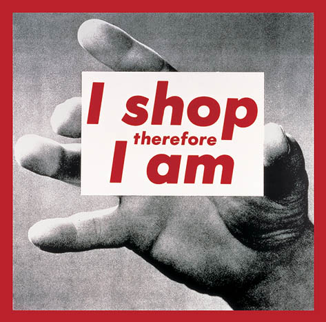
Barbara Kruger //
Barbara Kruger is often associated with Feminist art, and also that of Conceptual art. She combines tactics like appropriation with her great wit and also that of her direct commentary in order to communicate with the viewer and encourage the interrogation of contemporary circumstances.
BARBARA KRUGER KEY IDEAS //

BARBARA KRUGER KEY IDEAS //
- Kruger's use of text and that of images is shown to have a direct communication with the viewer. With a short statement, she has a critique about society, economy, politics, gender and also that of culture.
- Kruger uses the facade of Graphic Design in her work, using the unexpected phrases to catch the viewer's attention and make them focus on what she is wanting to convey. Instead of trying to sell a product, her work sells an idea to the audience.
- Kruger uses interesting statements // phrases as the solid evidence of her work, she then uses images from magazines and this is her backdrop. She is very consistent in her style of work, she uses a very easy to read font, and also uses her typical colour palette of red, blacks and whites. This is interesting as the end product // design is crucial for how an audience will see the effectiveness, as an artistic expression, and also that of a protest against the facets of a postmodern life.
My Own Opinions:
I first noticed a piece of Kruger's work, in my Religious Studies class in High School. I noticed that this particular piece of artwork was that of the classic "I Shop, Therefore I am" quote. I remembered seeing it and then in College, I was told to look at post modern artworks, and again I stumbled across Barbara Kruger's work in much more detail. I remember looking at all of her various art pieces, and saw that the colour palette was in her typical colours as stated above.
Subscribe to:
Posts (Atom)