BARBARA KRUGER KEY IDEAS //
- Kruger's use of text and that of images is shown to have a direct communication with the viewer. With a short statement, she has a critique about society, economy, politics, gender and also that of culture.
- Kruger uses the facade of Graphic Design in her work, using the unexpected phrases to catch the viewer's attention and make them focus on what she is wanting to convey. Instead of trying to sell a product, her work sells an idea to the audience.
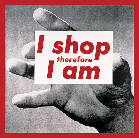
- Kruger uses interesting statements // phrases as the solid evidence of her work, she then uses images from magazines and this is her backdrop. She is very consistent in her style of work, she uses a very easy to read font, and also uses her typical colour palette of red, blacks and whites. This is interesting as the end product // design is crucial for how an audience will see the effectiveness, as an artistic expression, and also that of a protest against the facets of a postmodern life.
My Own Opinions:
I first noticed a piece of Kruger's work, in my Religious Studies class in High School. I noticed that this particular piece of artwork was that of the classic "I Shop, Therefore I am" quote. I remembered seeing it and then in College, I was told to look at post modern artworks, and again I stumbled across Barbara Kruger's work in much more detail. I remember looking at all of her various art pieces, and saw that the colour palette was in her typical colours as stated above.
No comments:
Post a Comment