Wednesday 17 June 2015

| Katerina Plotnikova |

| Katerina Plotnikova |

I remember seeing Katerina's pictures before, as I can recall seeing a number of her wonderfully, beautiful animal photographs. 
I have always been quite fascinated with animals being in photography, as it's unpredictable as you do not know what the animal will do. However, with Katerina she uses animal trainers to help create the perfect shot that she can.

She has used various animals, like that of: 
Bears, Wolves, Deer, Moose, Foxes, Tarantula, Snakes, Owls and many more. I think that all the animal shots are her best, as I love seeing humans interacting with quite dangerous animals as I love the uniqueness and surprise of the photographs. 

Of the animal shots, I believe that the Fox, Bear and Wolf ones are my favourite. I love them animals in general which is going to make me feel more passionate towards the photographs that she got of them, however the models included also make the photograph. I love that the models are wearing beautiful silk dresses whilst being with these animals. 

I love the pink silk dress with the bear, this photo makes me feel so happy and it looks incredible. to be able to get that close to a bear is wonderful. I am in complete awe of her work. 
Katerina's work to me is really inspiring and is a wonderful piece of art. 


| Namie Amuro |

| Namie Amuro |


Play Namie Amuro’s video in fullscreen mode and put your finger in the middle of the screen. It’s the perfect way to kill some time before that boring meeting you’re waiting for.

I first saw this video on a link from a social media website called Buzzfeed, this showcases various things from photos - videos - quizzes etc.
After being transported to the webpage from Buzzfeed's FaceBook link, I then watched the video from Youtube (Below).

I think this video is really unique, I love that it's quite interactive meaning that it is something that gets the viewer involved, and I like that. I like that you have to keep your finger on the DOT for the whole video.
 I also really like what happens throughout the video, as in the way everything looks front the angle you view the video with your finger on the dot..

I liked the basketball being spun on 'your' finger, to popping the girl's chewing gum. Overall, I believe that this is a very fun and quirky video from a very interesting artist.

| Arve Båtevik |

| Arve Båtevik |


I first found Arve's work on Behance, I was looking through on my activity feed and I saw some very interesting and beautiful work on a book. In the corner of the book I saw that it was cut out, and left a very interesting pattern. The book was made of card, or of a similar material so it could create that very interesting design in the top right hand corner. 

After more depth into Arve's work, I went onto his website and it is very simplistic, clean and beautifully created. 
The website is: http://arvebaat.com

He has had various designed jobs working in Switzerland, and Oslo – Norway. 


| HELVETICA / AN ODE TO HELVETICA |

| HELVETICA | AN ODE TO HELVETICA |


Helvetica [An Ode to Helvetica] is on Behance is by Rui Xu.
" Helvetica [An Ode To Helvetica] Type Design from the last 50 years. Editorial design project about the film “Helvetica” directed by Gary Hustwit. It features biography, opinion and work by David Carson, Massimo Vignelli, Paula Scher, Erik Spiekermann, Neville Brody, Stefan Sagmeister, Experimental Jetset, Wim Crouwel, Michael C Place and Norm. "

I remember at University when Gary Hustwit came to talk to us about his debut film of "Helvetica", and when I was on Behance I saw on my activity that someone had created a book about the film, by Gary Hustwit. Above is his description of the work that he had produced for this particular set of work and below is the images of that book.

| I found that the book looked beautiful, I loved the subtle yellow on the cover and keeping that theme throughout the book was very clever. I also liked that on the David Carson title page, there was a picture of him with the same yellow. 


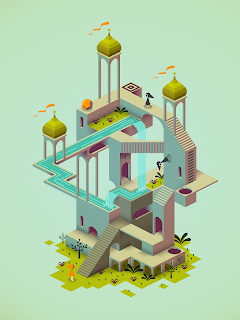
| Monument Valley Press Kit |

| Monument Valley Press Kit |


Monument Valley is an iOS and Android game, and it came out on the 3rd April, 2014. Monument Valley is a puzzle game, where you play as Princess Ida and you try to get her through the designated scene away from the crows. These scenes are also like mazes with optical illusions included. The game is presented in an Isometric View, which makes for seamless play, as I play this game on the iOS version, it is beautifully created and looks impeccable. 

This game was developed by USTWO.

I went onto the Monument Valley website: http://www.monumentvalleygame.com
where you can download the Press Kit for yourself.

Within the Press Kit, you receive a number of folders in which there is concept art, press release, screenshots and visuals assets. 


| TOKYO GHOUL CHAPTER 31.5 |

| TOKYO GHOUL CHAPTER 31.5 |

TOKYO GHOUL is of the manga style of art, and this comic is about a World in which there are humanoid like beings which are called Ghouls, that coexist with humans. Ghouls are like ordinary people however, for their diet they have to survive on human flesh. 

Below is the cover for the Chapter 31.5 of TOKYO GHOUL.
The main character of the comic is Kaneki, he was originally a human however due to an accident involving a Ghoul he also ended up becoming half Ghoul and half Human, after being implanted with Ghoul organs.

The image below is of Haise's interpretation of how he view's Kaneki. 
Kaneki in recent chapters has lost his memory due to being stabbed in the brain, now Kaneki has been given the name and the persona of Haise (which is still Kaneki, just without his memories).

I really like the cover art for this chapter. I love how sweet and young Kaneki looks however that is what this chapter wants you to think. 
I love this style of art, I've always been fascinated with anime and manga so when I was first shown TOKYO GHOUL, I found it to be really well drawn. 

In the Anime Adaptation and the manga we see Kaneki's eye changes to that of a Ghoul eye. The pupil stays black, whereas the Iris changes to that of  red, and then the whites of the eye turn black. (IMAGE BELOW)


Review | Nylon | The Music Issue | July 2016

| Marina and the Diamonds | 


I recently saw this magazine on Instagram whilst searching one of my favourite bands, which is Marina and the Diamonds. I love Marina's music as it's so unique to anything I've heard, it's quite poppy yet some of her songs have a melancholy vibe.

 Her first album was The Family Jewels which was released on the 15th February 2010, which featured the hit song of Hollywood, and also I am not a Robot. On this specific album it has been described at Indie pop, and also that of a new wave era. 

The Second Album was Electra Heart and this was released on the 27th April, 2012. I like that the first album to this one was two years apart. I liked that as it kept fans on their toes as to when her next album would surface. 

Now the third album by Marina and the Diamonds is titled as Froot, and this album came out on the 13th March, 2015. The thing that was different about this particular album of her's was that she stylised it to become a "Froot of the month" sort of thing, meaning that 6 six of the songs on the album would be released to fans every month. These songs were that of "Froot", "Happy", "Immortal", "I'm a Ruin", "Forget" and also "Gold".

| Nylon | 

The magazine of Nylon is very unique, I've not really heard much of this magazine which is a shame. I didn't look into many of the other covers for this magazine but I did see a couple which I liked which will be showcased below in image form, with a little description. 

As to the Marina cover, I thought that this was a beautifully artistic cover. The way the colours popped on the front gave so much to Marina's attitude and to her music. The colours are that of blues, pinks and oranges, and these stand out from the other magazine that would be next to them on the shelf in magazine stores across the world. 

As I couldn't find this particular magazine in any shop or even online to be shipped directly to me, I had to read this magazine on the Nylon, website: http://www.nylon.com
Then I looked at the article about Marina: http://www.nylon.com/articles/marina-and-the-diamonds-cover-story

/ Everything on this article is do with her newest album of FROOT and about her processes to come up with the album and amongst other things. This article also talks about the previous albums with the inspiration that came with them, I particularly liked the album of Electra Heart. I liked this album so much because of the music itself but I also liked Marina's alter-ego. I liked that she wore a platinum blonde wig, and was associated with pink/barbie and bubblegum.